If you love colour theory, hello fellow chromophile! Depending on your cultural background and individual experiences, different colours evoke various psychological and emotional responses, influencing perceptions, moods, and even decision making. It then becomes a no-brainer that you should willfully and consciously influence what you feel.
The same way you dress to impress, this approach can be applied when you decide to furnish your home. Be intentional with creating the mood you want your home to convey. Remember that even the most subtle change creates a difference in atmosphere. Enter the colour palette!
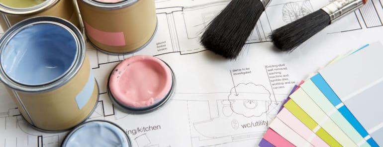
Choosing a colour palette isn’t just about the wall paint, it is also about the floors, furniture, and accent pieces. Hue is not the only factor to consider, tone (hue mixed with grey) is also important. Now let us explore where these colours and their tones work best in your home.

Monochromatic palette: Symphony of a Single Hue
A monochromatic palette consisting of one hue in different tones and shades, is a crowd pleaser. Why? Because monochrome creates harmony and cohesion. For example, in a space where you want to create a calming effect, you can choose to go from light steel blue as the main colour to midnight blue as an accent or secondary colour. Let your inner child come alive and play with light and darkness in one hue- you can’t go wrong with monochrome.

Earth and Neutral: Embracing Nature’s Palette
Earth colours derived from natural elements include brown, green, terracotta, and others combined with neutral colours, white, beige, cream, and other varying shades. These colours work well in a study area where the neutral colour creates a balance of sophistication and organization, while the earth colour evokes a stable and grounding effect. For example, cream walls with brown furniture makes for a cozy office space.

Coral and Turquoise: Under the Sea
This right here is one of my favourite combinations. Both colours are associated with the ocean and compliment each other very well in a colour palette. These colours are bold and energetic, together generating a vibrant atmosphere. With the warmth of coral and the cool of turquoise, they pair well with neutral colours creating a visual contrast. These colours are best used in family rooms to blend the lines between outdoor and indoor space.

Charcoal Grey and Orange/Brass: Elegance and Zest
This is another great contrast of sophistication and enthusiasm. According to psychologists, warm colours are seen as inviting and draw people further into the room, while bold neutral colours like dark grey promote social interactions. Dark grey walls with orange accents will get people into the room and have them talking. The heart of the home is a room where these colours will bring liveliness and warmth of conversation shared over a meal.
The art of interior design is a delightful dance with colour combinations. It is a language spoken without uttering a single word. It has the ability to attract the eye and nurture the soul with its reflection of passion, exuberance, calmness, and balance. So next time you want to style your home, think about what mood you want to impress within that particular space.